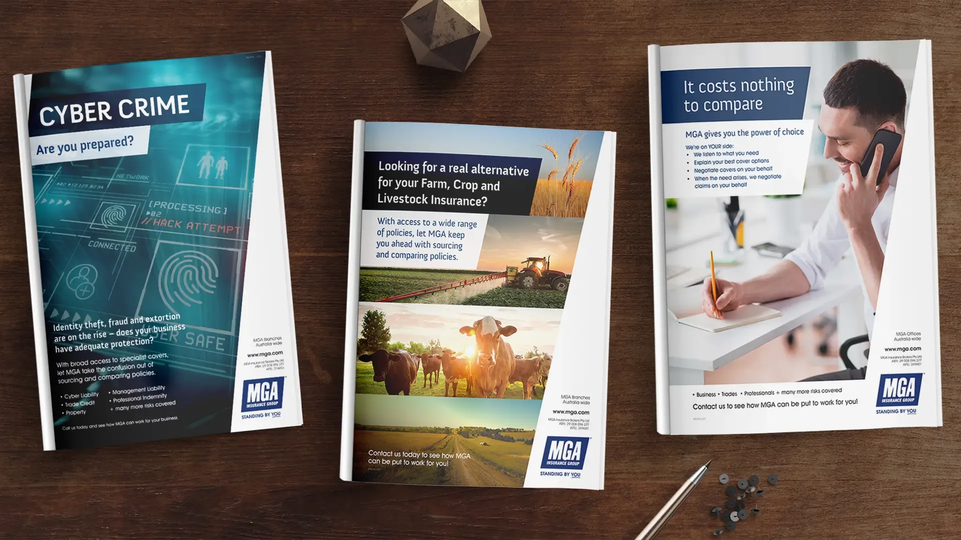
Building long term relationships with our clients is what we strive for; delivering a quality, reliable, and consistent service. MGA
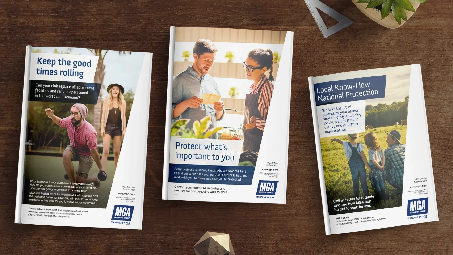
Insurance transitioned to Creative Pod in 2010 initially to create some traditional media advertising.
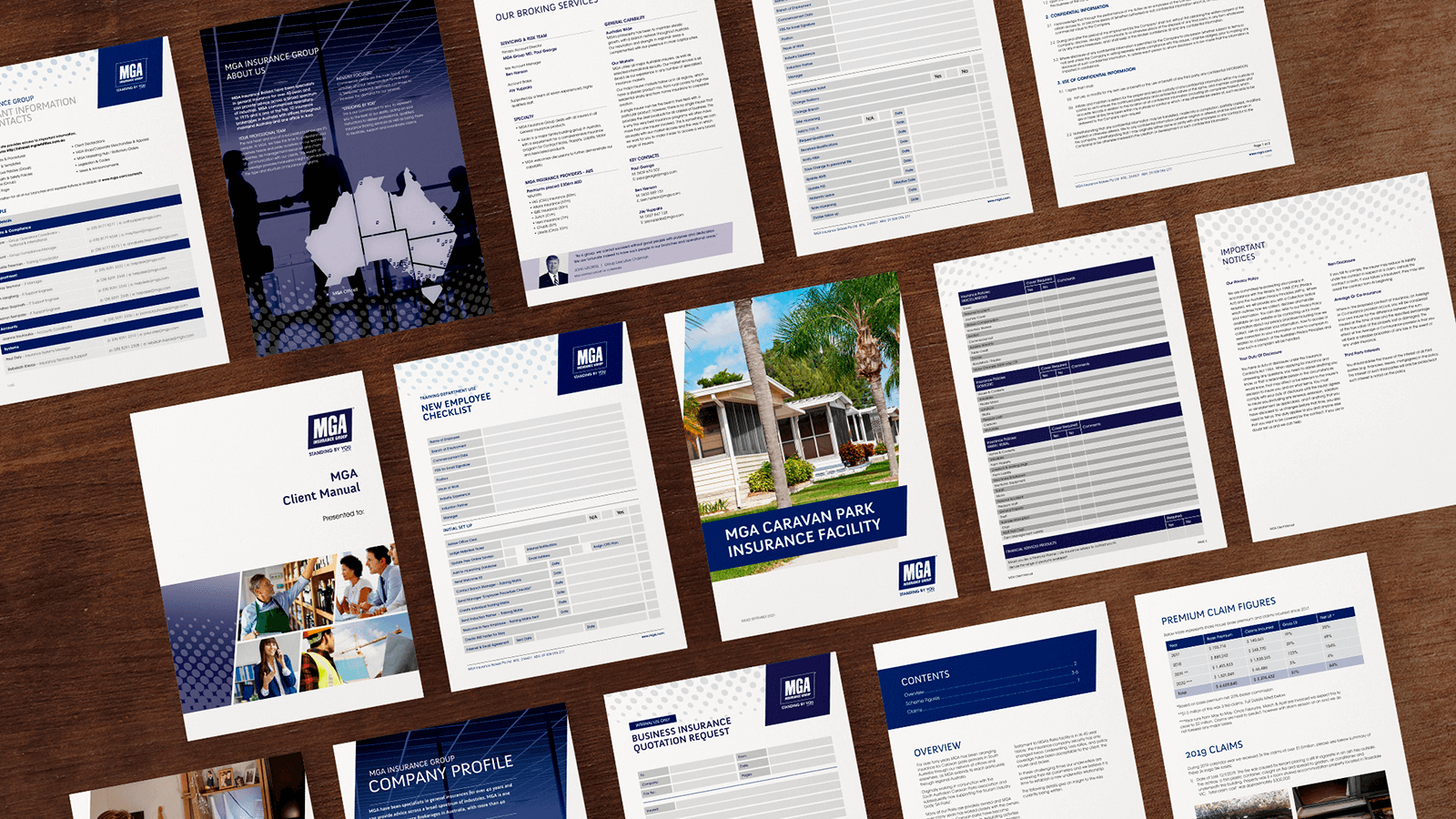
Over the years we have evolved their brand style and existing logo to deliver a consistent corporate and professional tone. The brand
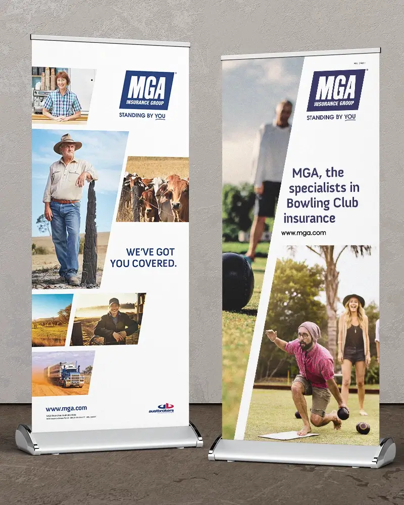
style has been built to be easily recognisable across all media, from B2B documents, through to advertising, and signage.
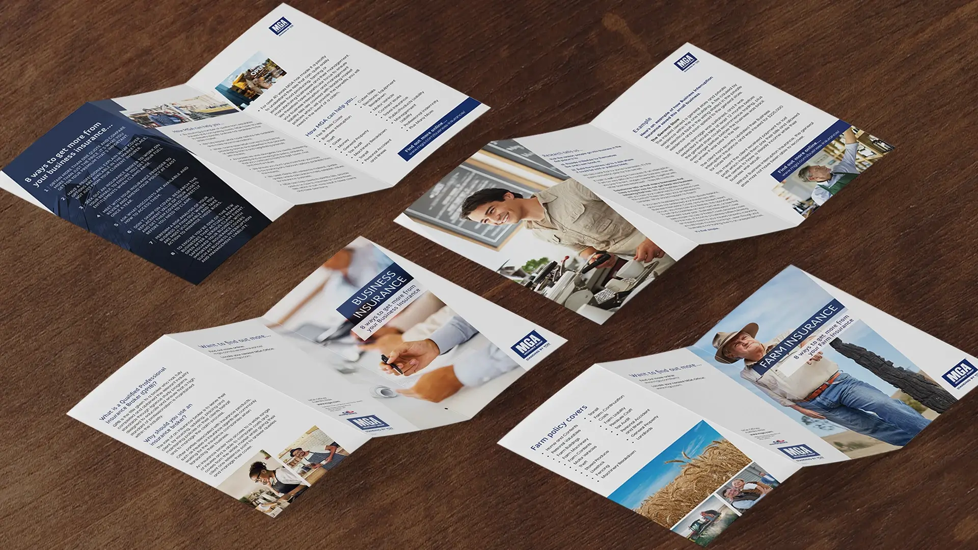
The scope and target audience of the projects are varied and include collateral such as a brand style guide, company overview, PDS's,
stationery, product brochures, certificates and presentations. The key to creating successful designs is including relatable high impact
imagery along with simple and easy to understand information that prompt consumers to take an action.
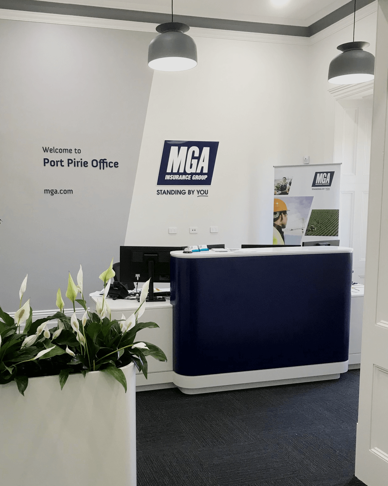
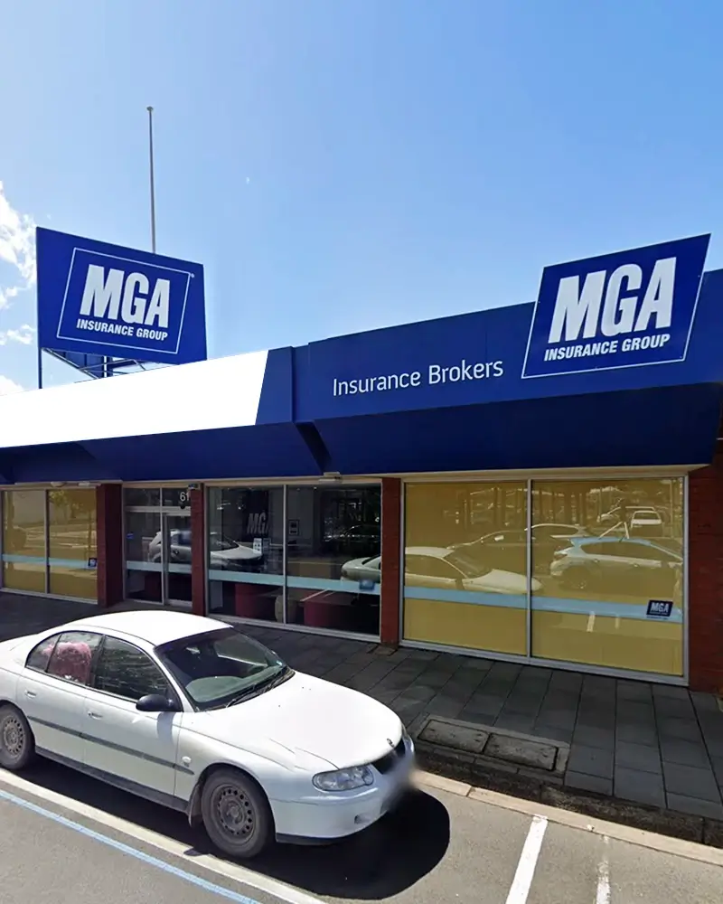
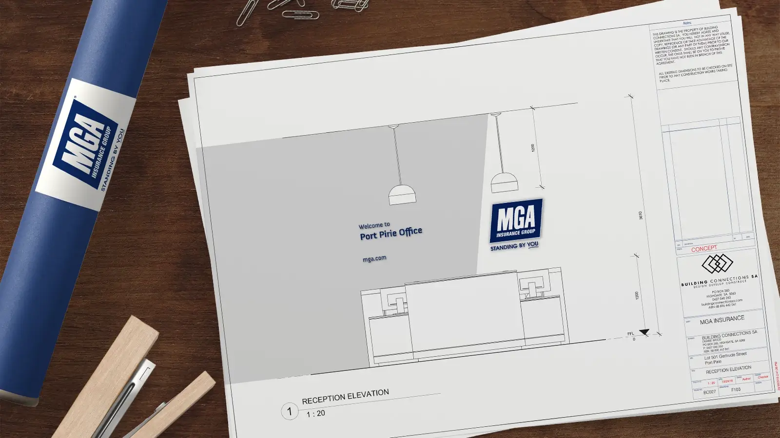
The branch office signage has been designed to align with the MGA Branding Style Guide and requires being applied across all building
shapes, sizes and colours, to achieve a consistent look. The consistent style is also used on internal signage, promotional, and display
signage across Australia.
